


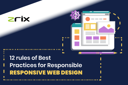
Best Practices for Responsible Responsive Web Design


Nowadays, every customer and client want to access websites on the smartphone. Around 50% of traffic on any website comes from mobile devices. Therefore, it is very essential to keep a single website design for all devices, platforms, operating systems, and different screen resolutions.
In the field of website design and development, nobody wants to design different UI/UX and write codes respectively for multiple devices, platforms, and OS. What we all want are a responsive UI design and codes to keep up with different devices and screen resolutions!
For this specific purpose, we have to use the rules of responsive designs to create the best web designs and layouts that easily run equally at the same speed for any user.
Today, this blog post will tell you the required responsive web design techniques to create an attractive website.
Quick Navigation
A responsive website layout isn't only a matter of compressing, stretching, or putting in the best colors to a website. It’s on the first hand is related to turning a website into every screen dimension.
And making it is really a difficult task because you need to add, remove, and prioritize tons of things in only one code base!
In reality, it takes a professional responsive web design services provider to responsively code the site and give the best satisfactory web layout.
"Therefore, responsive design is the most favored approach to make a multidevice website."
What Is Responsive Web Design?
According to the RESPONSIVE word in the IT and Software development industry, design and development must respond to screen size, platform, OS, user behavior, and many more.
Responsive UI designing is a practice of mixing layouts, grids, images, etc, and intelligently using CSS. As a result, when the user opens the website on a laptop, desktop, iPad, iPhone, Android phone, and tablets, it automatically switches to any screen resolution, image size, color gradients, and scripting abilities.
Also Read: Avoid Web Design Mistakes To Build Best Websites For Clients
But, there comes a point that we must understand -
“Responsive web design is not only limited to resolutions and resizable images. On the other hand, it is all about designing in a new manner.”
Today’s internet tells us to be more creative in whatever work we do. That means every web designer must know to create a mobile-friendly and web browser friendly responsive web designs.
To do so, you need to follow different rules of responsive design principles.
But, first, let’s know what mobile-friendly design and web browser-friendly web design really is!
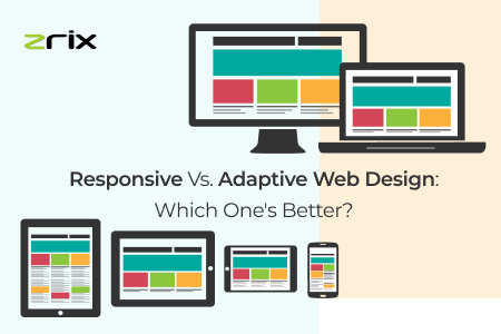
Responsive Web Design - A Mobile-first Approach!
Mobile-first website design means designing a website that works on any smartphone responsively along with all desktop versions. This approach works clear and well for all website designing companies.
Mobile is easy to use and fits best for usability. It is efficient, practical, and easy to focus on a website design specific to mobile devices. Therefore, you can create visually and functionally a better website design.
“Try scaling up the website design for the mobile version.”
Once you make a responsive web design, you offer a seamless experience to the users whatever the device and web browser you use. The only thing that matters is how you check responsive web design testing.
Remember, a website design must be compatible with all mobile and desktop browsers!
Finally, we can say to create an optimal user experience at different screen sizes is the responsibility of responsive website design.
We are the top web design services company in USA that helps the clients to make the best one-touch responsive website!
Some Important Responsive Design Principles
Website designers and developers should understand how enterprises want their websites to look. While the customers seek all the required and necessary information in a beautifully designed web page. Role of web designers and developers in very important!
To make a unique, sustainable, responsive website design you need to follow the below responsive web design techniques:
| Smooth 2D/3D Interfaces | Interactive User Experience |
| Full-Screen Forms | Proper placement of images, PDFs, etc. |
| User-friendly & Mobile-friendly website | Focus on headlines & subheadings |
| Utilize White/Negative Space | Good control over typography |
| Well structured web layout | Use Call to Action Button |
| Pick The Right Colours | White Open Space |
| Purposeful Animation | Less use of jargon |
| Good use of CTA’s | Gradient, Blazing colors, and Visuals |
| Design & SEO combination | Simple Mobile App Navigation |
| Create easy to read website content | Use of proper heading, subheading |
| Voice User Interface | Diffusive Backgrounds |
| Background animation | Innovative Scrolling |
| Stick to standard layouts | Parallax Web Design |
| Big & Bold Fonts | Compressed videos and audios |
In addition to the above principles, you need to follow the coming website design trends such as 3D Designs, Oversized lettering, Asymmetric Layouts, Hidden navigation, Custom Images, Split Content, Voice User Interface, Parallax Web Design, Animation, Full-Screen Forms, and more.
Also Read: How Website Design Services Helps In Online Lead Generation?
“Always focus on making better UI and UX with the best Easy content layout, Front-end, Back-end designing, and Server-Level optimization.”
You can also take the help of frameworks for responsive web design such as Bootstrap, jQuery, Laravel, Angular, etc.
What is your thought n using responsive website design frameworks? Mention us in the comment section below!
Conclusion
With more and more usage of responsiveness in designing and development of a website, it has now become important to understand user requirements on a particular website.
Though we have discussed several responsive web design techniques, rules, and principles, these cannot run all-time. Responsiveness is just a concept that is proportional to the web requirements of users.
It means evolution in website design practices, which is a continuous and never-ending process!
And our designers work on this process all the time to give clients the best website, while we retain our position as a top website development company in USA.
If you have doubts about the best practices for responsive web design, then mention them in the comment section below. We will answer your every query!